Beginning Drawing Project

|

|

|

|
We were assigned to draw a tree, an animal, a street scene, and a hand in plain pencil. I chose a bunny as my animal and did my hand in the "rock on" symbol. I also used a lot of shading and blending in my drawings.
Prismacolor Fruit

|
We were supposed to draw a fruit with Prismacolor pencils and I chose a pear. This was actually my first time using these pencils so it was a little different but I tried my best. I also made the mistake of drawing it on black paper which made the yellow not show up very well. However, I think the stem looks pretty accurate and I have learned more.
|
Watercolor teChniques

|

|
We did different watercolor techniques and learned how to shade and darken colors. This helped me create colors and know techniques to use in the future.
Watercolor fruit

|

|

|

|
For this project I chose to paint a tomato and I did it with complementary, monochromatic, cool, and warm colors.
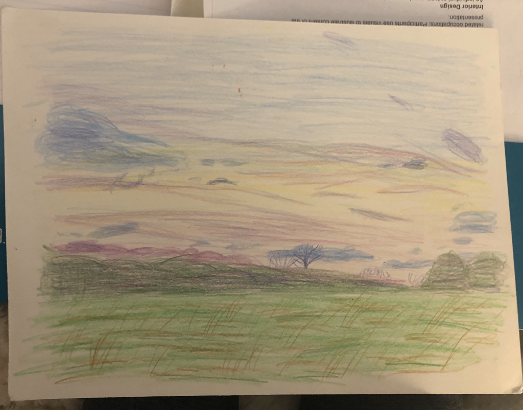
watercolor landscape
|

|

|

|

|

|
1.) Some of the watercolor techniques I used were the gradient and wet on dry to successfully paint the sky. I also dry brushed some parts to add details into the trees and grass. Lastly, I also blotted some sections to lighten the area that had too much color.
2.) It was important to use transparent layers in my painting so I could layer. I kept the background sky very light, almost transparent so I could layer the darker colors of the clouds on top. I also started off with light layers in the grass and trees to keep darkening them over time.
3.) I think the composition of my piece is successful because the different layers and colors bring together the painting. I used the elements of art by using shapes, values, and color in the sky to turn them into clouds. I used the principles of design like contrast and repetition to emphasis certain parts of the painting.
4.) Color choice is very important in this piece to embellish on the details in the picture. The different shades of blues, pinks, and purples all show dimension in the clouds. Then the use of dark greens and browns don't quite match the picture but still show the depth in the trees and grass.
5.) I think the craftsmanship of this piece is very neat and realistic.
6.) If I were to change anything about this painting I would fix the grass. Mainly because I don't think the color matches up very much and I would add some reds into it to make it less green. I also would have started with the brown in the grass first and then go over it with the darker green to get more detail than I have now.
7.) Before doing watercolor in this class, I could only blend the colors just to make a cool gradient. However, I've learned more and experimented with letting it dry and layering on top (I had issues before this class with making it too wet and then the paper would roll up) so it has a different effect. Painting this watercolor piece has taught me a lot and allowed me to see that I can actually do with watercolor paint and try it out more in the future.
Huntertwasser and Klimt Notes

|
We wrote paragraphs on both artists, Huntertwasser and Klimt. We described their lives, art style, and added pictures to show some of there pieces. In the end, I decided I liked Huntertwasser's art better and took inspiration from him using the swirl, non-straight lines, and bright colors.
|
Huntertwasser Painting

|

|

|

|

|

Finished product after taking constructive criticism
|
1.) The craftsmanship of my painting is very neat and clean. I tried my best to layer the paints so there were clean lines.
2.) I embodied Huntertwasser's style by incorporating a lot of themes he has in his paintings. For example, I added the spiral trees, the bright colors, and non-straight lines. I think by using these techniques and overall "weird' ideas, I was able to create a piece that embodies his style.
3.) The colors in my piece are based off of the placement and which "world" they go in. The normal world has plain colors like blues, grays and browns; the under world is just a mash up of bright colors like orange, purple, and green, etc.. I didn't use a specific color scheme.
4.) There isn't really one focal point of my piece. I wanted the emphasis to be mainly on how the painting is split in half. If one part were to be the focal point I would want it to be the under world because it has brighter colors and interesting shapes.
5.) I added patterns on the buildings and trees to add more detail and give it more of an interesting look. Lastly, I also added embellishments of silver sharpie on the windows to make them look shinier.
6.) I didn't add a border to my painting.
7.) One of the difficulties I had with this painting was the paints being see through so I had to spend a lot of time layering them. Also, somehow (maybe from the drying rack) some stuff got on my painting and chipped the paint so I had to redo the background. Lastly, I had a little bit of difficulty trying to add details into the painting and making it too blocky and "cartoony."
Fruit/VEggie Oil paintings

|

|
This was my first time using oil paints and I chose to do the pumpkin with a palette knife and the apple with brushes. It took me a while, but I finally got the hang of using the palette knife and was able to layer the paint on. I actually like using the brush better though because it's easier to blend and I feel like I have more control.
OIl Landscape

|

|

|

|

|
1.) The craftsmanship of my painting is very neat and blended. I made everything very detailed and realistic because I like that style better. I think it is well executed because it looks almost exactly like the picture.
2.) I used mostly cool colors in my painting, which gives it a calm look. I also added pops of pink and orange to the trees and flowers.
3.)There is contrast in my painting because of the white, pink, and orange against the cool colors.
4.)I applied texture by using a thick layer of white in the trees. There are also highlights and shadows used in rocks and branches.
5.)I created depth in my painting by making the rocks that are close to the camera bigger and the ones farther away smaller. The trees are also lighter as they get farther away.
6.) The painting technique I used the most was probably dabbing on the paint and I think it helped give the look of all the leaves.
7.)I had difficulties putting in all the detail into the water and branches. It also took a long time but I was able to finish it.
8.) I think I was successful because I made my painting really realistic and match up with my reference by spending a lot of time blending it so there were no brush marks.
Oil Fur

|

|

|
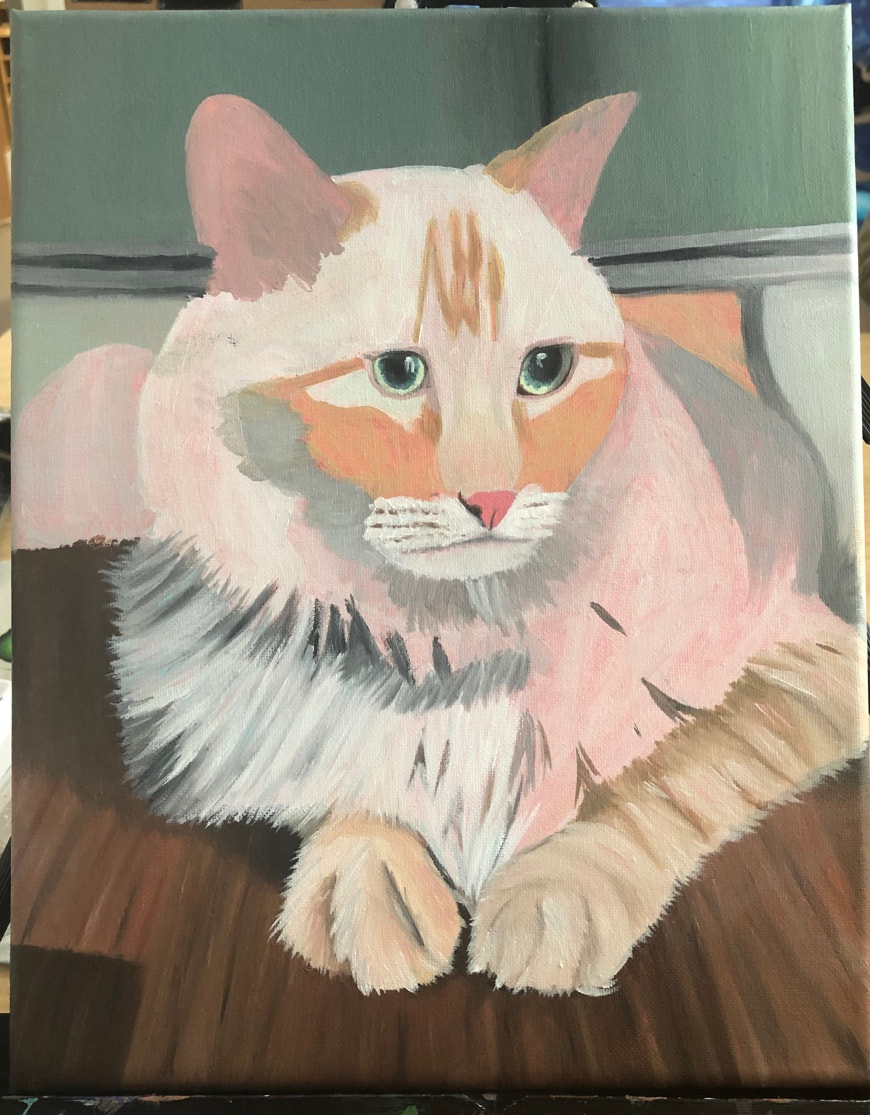
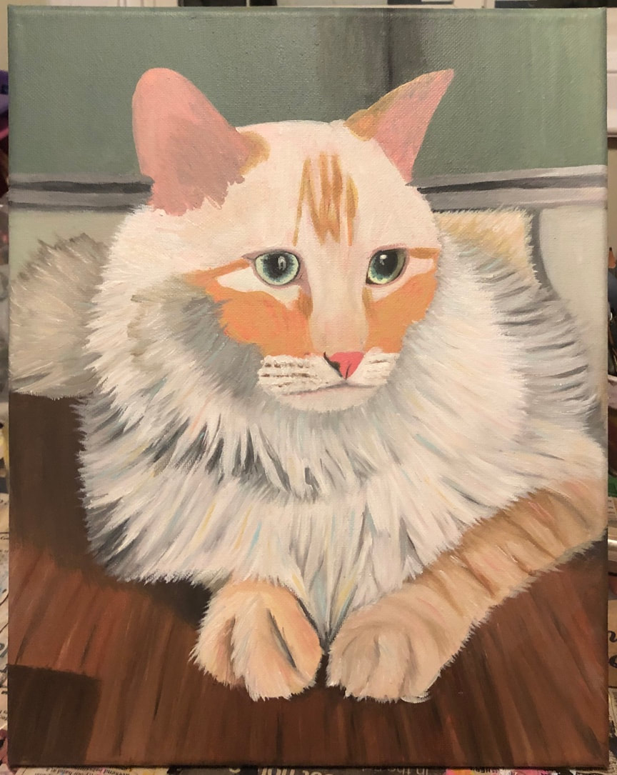
Pet portrait

|
|
|

|

|
1.) My painting was of my cat Jake Murphy. Overall, I like the way out turned out and there are some things I especially like such as the ears, the fur, and the inside of the eyes. However, there are some things I dislike about my painting which are how small I made the eyes, paws, and nose, and how I lost the warm browns and oranges by using grays and blues.
2.) I accomplished a bright and cool aesthetic with the colors I chose. I also think I was able to create really distinguished fur by layering thick paint and also blended a lot, which made it very realistic.
3.) First I started by blocking out the colors with a thin layer of paint, so it would be easier for me to layer the fur. I didn't really do what I was supposed to by adding a layer of one color of fur everywhere and then doing it again with another color. Instead, I worked in sections with a base color, then added the shadows, then added a thick layer of white over it for highlights, and then lastly I added in pops of color such as blue and an orange-pink.
4.) This was my first time painting fur and at first I was a little intimidated. I wasn't really sure how to do the fur in the best way but then I figured out a good plan. I think doing this project help me grow and learn how to paint animals better.
5.) The craftsmanship of my painting is very neat and well blended (except for the fur of course). And I think I executed it very well and made it realistic.
Glass Painting Sketches and Practice

|

|
Glass PAinting

|

|

This was my first time painting glass so it was a challenge but it was a fun experience to try. One thing I struggled with, at first, was giving the effect of glass without covering up too much of the black. Although, in this painting, I think I didn't add enough of some white smudges to make it look like 3D glass. In the end, however, I think that it came out looking pretty realistic and similar to the picture and I'm proud of myself for accomplishing this glass painting.
Final CHoice painting

|

|

|

|

|
