beginning drawing project

|

|

|

|
For the beginning drawings we had to draw shoes with laces, a portrait, a city perspective, and hand. These aren't my best drawings, but after reviewing I realized some shading and perspective mistakes I made so I can improve.
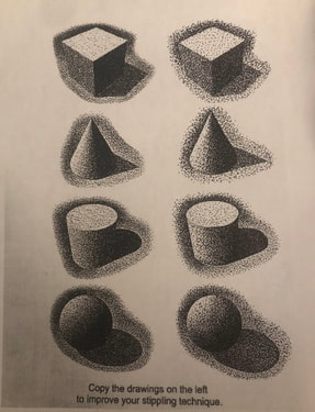
shapes and shading

|

|
I haven't drawn in a while so it was good to catch up on the basic shading techniques. It took some time but, end the end, I think my pictures came out pretty good. I also learned not to blend with your fingers so that created a challenge to have very soft lines.
Perspectives
I've only done 1 Point and 2 Point perspective before so it was cool to learn about more. Also, before I had only done perspective with boxes but now I know how to apply it to different pictures. It was interesting to keep adding to the picture to create even more depth. My favorite may be 1 point because of the way it looks, but also birds eye because of its complexity. I think now I can apply the different ways to create perspective myself.
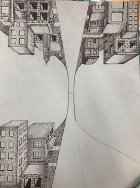
1 Point Perspective

2 Point Perspective
|

|

|

Worms Eye View
|

|

Lego Perspective drawing |
Birds Eye View

|

|
We built a Lego building that was actually quite intricate. I struggled at some points trying to match up the vanishing points and there were some details I wasn't able to include. However I think this was a challenging lesson that helped me understand shading and perspective better.
|
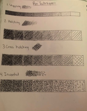
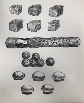
Pen Techniques and textures
|
|
|
I’ve done pen and ink projects before but I think these lessons taught me a lot. I didn’t know that you could create value with different shapes and patterns until now. These videos and lessons taught me a lot about how to use the pen and turn it into realistic textures and values.
Pen and ink drawing
|
|
|

|
|
|
|
|
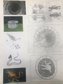
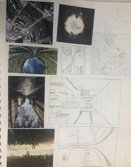
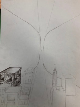
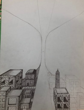
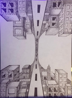
1.) I chose different pen techniques to give different textures on the buildings and ground. I used stippling and hatching for concrete and the pavement road. I also created a pattern on some buildings to look like bricks. Then lastly, I created an invented technique to look like grass on the ground.
2.) I used a one point perspective to make it look like you were looking down a path. Then did it again on the other side to create the illusion that it was a rounded road with a city on the top and bottom.
3.) Texture is important in my composition to give all the areas detail so nothing was just flat and boring. I wanted to create different patterns to give each building a different look.
4.) Value is important in my piece so that each building looked realistic and so everything had depth. Also in order to achieve the idea that there were two cities on top of each other I had to make the farthest part of the road darker.
5,) I think the craftsmanship of my drawing is very clean and neat. I did my best to make all the lines sharp and precise so all of the buildings fit the perspective.
6.) If I redid my drawing I would have added something else to the background so it was not blank. Also one side of the city has more types of building than the other so I would go back and add more details into the lesser side.
7.) It was important to understand the different concepts so I am able to successfully create a visually pleasing picture. Also so I can achieve different textures with the techniques we were taught.
8.) I think this lesson will help me in the future because I learned a lot of different ways to create textures. Also the last time I did a pen and ink project I did the whole thing in stippling. So this way I was able to practice different techniques and improve my skills.
colored Pencil Practice
.This is only my second time using Prismacolors so I still had a lot to learn about creating tints, shades, and textures. I also learned more about blending because I did not know there was a colorless blender.

|

|
Ice CReam COlored Pencil Drawing

|

|

|
I'm actually really proud of this drawing because I think it turned out very realistic, and a lot better than my pear from last semester. Because of my past experience, I knew to choose brown paper if I was going to be using yellow. I also added extra colors to add depth in the drawing such as: in the purple I added some blue colors, in the yellow I added green, and in the orange I added red and brown.
Up close Nature Colored Pencil drawing

|

|

|

|

|

|

|
1.) The craftsmanship of my drawing is very neat and well executed and I think it looks very realistic.
2.) I think i used a lot of different values that created a lot of depth because each petal stands out.
3.) I represented the style of Georgia O'Keeffe by taking the picture very up close and using vibrant colors to create texture and depth.
4.) I chose colors similar to the picture like pinks yellows and greens and blended them together to create new colors that are also apart of the picture.
5.) I created contrast by really making sure the shadows were dark and and the highlights were bright. This made each petal pop when the bright colors were next to the dark ones.
6.) I really paid attention to each detail in the picture and used different values of colors to create textures, highlights, shadows, and contrast.
7.) Sometimes I had difficulties blending all the colors together and making sure there wasn't any grain from the paper in the background and that's what I wish I could have improved- layering the colors so that the paper didn't show through.
A moment in time photograPhy

|
Warm Up: I took this picture last year at the beach and I edited by making it more vibrant so the colors would be brighter.
|

|
One of the hard things of being in lock down during this Pandemic is not being able to see any of my friends. A big part of what keeps me happy and motivated is hanging out with people I love spending time with. Luckily, I have been able to visit my friends by sitting in the back of our cars (staying 6 feet away) and getting to talk to each other. This picture makes me happy because this is one of my friends and I had fun the day it was taken. However, it also makes me sad because I long for the times that we used to be able to hang out normally.
|

|
Another downside of being quarantined is that I no longer am able to go to the classes I regularly attend. This picture is of one of my Zoom dance classes. It's been hard having to learn at home for dance and school. I also miss being able to see my friends every day at school and then be able to go to dance and see my other friends. They were really what made everything better and sometimes I wish I could still be around them.
|

Getty mUseum art challenge |
On the bright side, not everything has been terrible during quarantine. We've had a new addition to this family: Cooper Bond. He is the sweetest Labradoodle mix and my whole family loves him so much. He has been the little glimmer of happiness in our home during this time and I'm so excited hes a part of our family.
|

|

|
I chose this painting by Paul Cezanne because I thought it would be easy for me to recreate with the items I had in my house. I had fun doing this with my mom because she helped me find some of the pieces for the painting. The most difficult part of this picture was deciding what pitcher to use because I had one that was the right shape but it was clear so you couldn't see it, so I went with the metal one. I also learned a lot from this project because I had to do a lot of research on different artists to see what kind of art they did. This project was fun and allowed me to see the work that a lot of famous artists have made.
making art from a found object
|
I wanted to make a picture using something with an interesting shape that I usually wouldn't think to use. I was looking around my house at different objects and had a few ideas for some but mainly I could only think of faces from something round. Then, I looked at my tape dispenser and right away thought that could be a slide. So I put it on the paper and drew a pool, but then thought I needed to fill up more of the paper and added a person and a lifeguard stand. I also added a pop of color to some parts so they stood out.
|

|
